mobility app
Brella
One app for every ride, insured for every trip
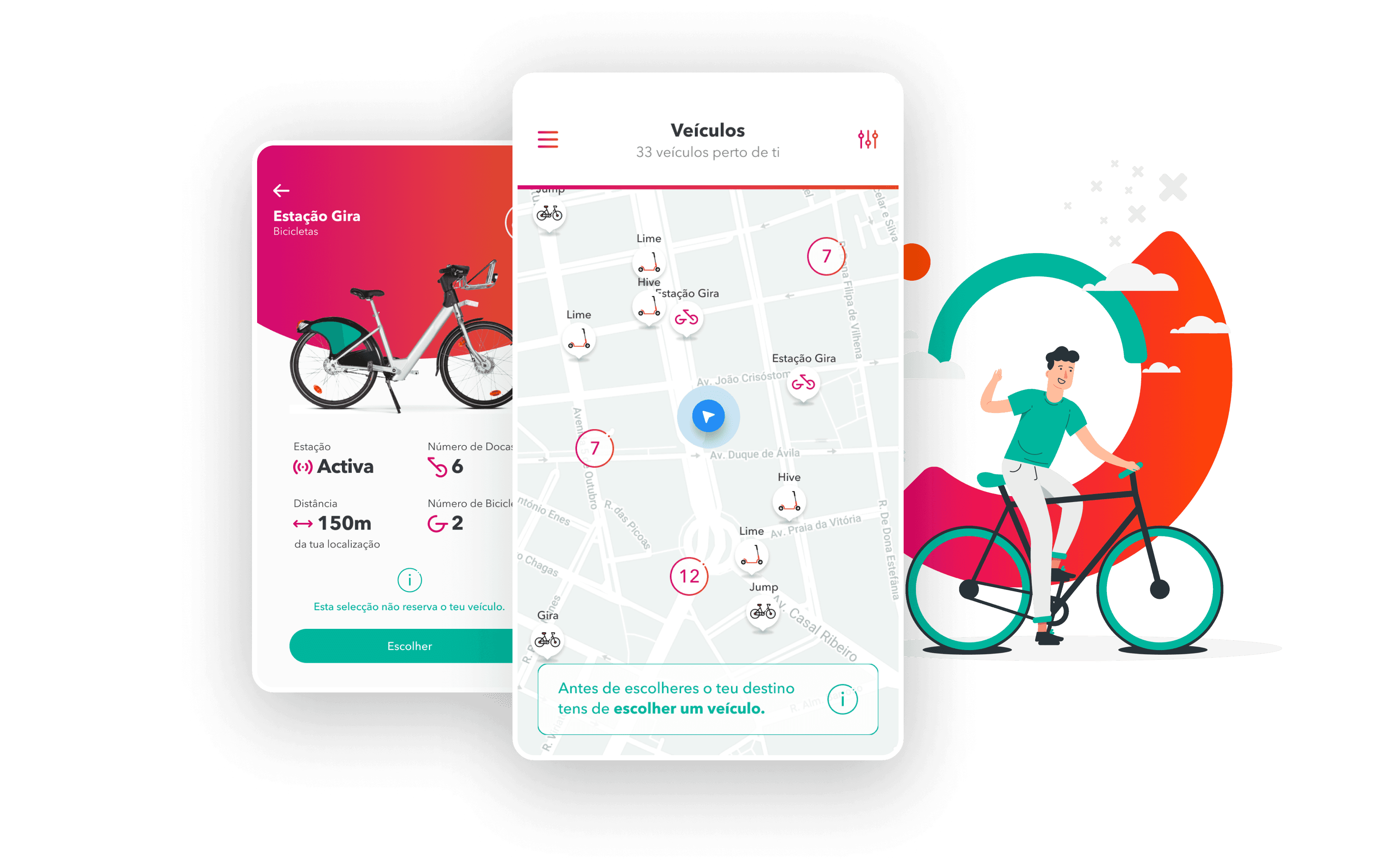
Brella is a mobile app MVP that brings all soft mobility providers into one place and helps people choose the best route for their trip. Created for Ageas Seguros, it added a feature that goes beyond mobility: instant insurance tailored to each journey. One app to plan, ride and be covered.
All providers, one app
Soft mobility services come together in a single place, so users don't need to jump between apps to plan a trip.
The best route for you
The app compares the options and suggests the route that fits the trip.
Insurance built around the journey
Instant cover tailored to the trip, so users are protected for the ride they are about to take.
Way of work 💡
The approach I used for this project
Research & USP
A review of existing mobility and route planning apps to find where a single app for soft mobility, with insurance built in, could stand apart.
UX Flows & Wireframes
Flows for planning a trip, comparing providers and getting instant cover, with wireframes that fixed the structure before visual work.
UI Design
High-fidelity mobile screens for the key moments of the journey, from choosing a route to getting insured, in one consistent visual language.

Brella is a mobile app that brings bikes and scooters from different providers onto one map and builds each route around how you want to ride. Choose a vehicle, pick a safe, fast or scenic route, and get guided from the first turn to the trip summary.
One map, every provider
Bikes and scooters from Gira, Jump, Lime and Hive share a single map, grouped when crowded and filterable by type and brand. Each vehicle shows its battery, price per minute and distance.
Three routes, one choice
Every destination gets a safe, fast and scenic route, with time, distance, share of cycle lanes and an elevation profile. The cheapest option is flagged, and scenic routes can include stops like cafés, parks and viewpoints.
Guided from start to finish
Large turn-by-turn directions show the distance to the next turn, and the app prompts you to unlock the bike at the dock. The trip ends with a summary of time, distance and CO2 avoided.
Insurance built into the trip
Instant cover tailored to the journey is offered as part of the route, so users are protected before they start riding.



The Helvengo project was a challenge in handling "Complex Logic" within a regulated industry. It proved that even the most "boring" or complicated industries can be made intuitive through strategic product design.
Designing for Trust
In Insurtech, transparency is a design feature. Clear feedback loops and plain-language labels are more important than aesthetic flourishes.
Turn complex to logic
I learned to translate dense underwriting rules and regulatory requirements into clear, deterministic user flows. By mapping out the underlying 'If/Then' logic before touching the canvas, I ensured that even the most complex risk assessment felt effortless and predictable for the end user.
Scale capabilities
Building for a startup means designing for who they are today and who they will be in three years. I focused on creating a 'Design Infrastructure' rather than just a UI Kit. By implementing modular UI schemas and semantic tokens, I enabled the platform to scale from a single insurance line to a multi-product ecosystem.